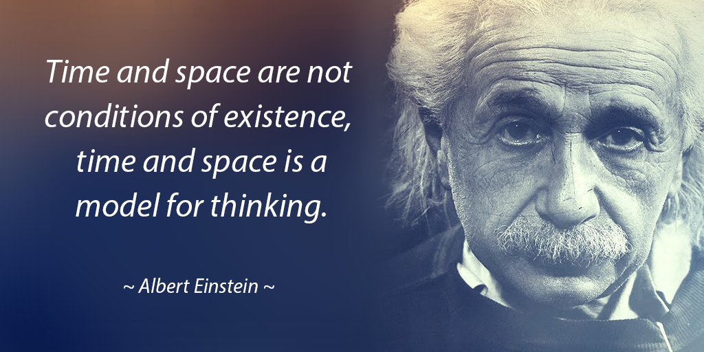
Einstein was right – perception of time matters.
It’s very difficult to put into words, but our perception of time is no longer the way it used to be.
Our perception of time is re-written when we suffer a brain injury. Time is something we struggle keeping track of. It’s constantly changing every minute, hour, day, month and year. Ask anyone who has a memory or cognitive impairment what day it is, or what time it is, and you’ll notice a blank stare in their eyes as they quickly try to reference their watch or phone. You see, not being able to mentally track time causes a huge problem when it comes to using a tool like a Calendar or Reminder app. These apps are built on time, everything you do within them relates to time, and none of these apps seem to take our new relationship with time into consideration.
Most apps display dates the same way: Thursday, April 6, 2017… (some even display it as 04/06/17- which is absolutely mind-bending for us). We look at these dates and we couldn’t tell you if this date is in future or the past, until we can figure out today’s date. In other words, there’s always some mental processing and calculating going on with dates and times before we can get on with creating/managing an event/reminder. It’s kind of like asking the average user to solve the theory of relativity before doing something.

What our users taught us about our relationship with time.
We figured something out… we discovered that less is more (I know… it’s very cliché, but very true in this case). We held focus groups to confirm our findings and we found that everyone was struggling with the same issue. Instead of displaying all dates as “Thursday, April 6, 2017”, we started to display dates and times based on the distance away from now. For example:
- If something is due within the next hour, we display “in 35 minutes” instead of “Thursday April 6, 2017 at 3:20PM”
- if something is due tomorrow, we display “tomorrow at 2:45PM” instead of “Friday April 7, 2017 at 2:45PM”
- if something is due in a few days from now, we display “Monday at 3:00PM” instead of “Monday April 10, 2017 at 3:00PM”.
This distinction in the amount of time suddenly starts to make sense again without having to process dates and times. Here is a list of how we display time (assume today is Thursday April 6, 2017 – 1:00PM):
in 30 minutes
at 6:00PM
tomorrow at 9:00AM
Saturday at 10:00AM
Sunday at 10:00AM
Monday at 10:00AM
Tuesday at 10:00AM
Wednesday at 10:00AM
Thursday, April 13 at 10:00AM
As you can see, the further away time gets from now, the more relevant information we display. Qcard has created a system our users can simply understand.
What else did other Apps get wrong about time?
Now that you’re paying more attention to dates & times within apps, you’ll quickly notice that Apple iCal, Apple Reminder, Google Calendar and many more do not display the current date, even when you’re creating a new event, browsing through days or selecting a future date. All this becomes very confusing for us. Qcard conveniently displays the current date & time along the top of your screen, no matter where you are within Qcard 🙂
Our Brains ♥ Qcard
